The primary bedroom has a king bed, sage green walls, and its own bathroom with a soaking tub. We wanted it to feel like a small suite within the house. Here’s how we chose the tile, colors, and furniture.
That's harder than it sounds. A room that size can easily go hollow. Too much floor, not enough warmth, everything floating rather than anchored. Too much bold and you've built a headache instead of a retreat. We had a clear vision and still went through five rounds of tile samples and more green paint swatches than I want to admit before we got there.

The primary bedroom. Sage green walls, king bed, live-edge bench at the foot, Talavera tile floor. The ensuite opens through the archway on the left.
The casita concept
When Dawn Asher at The Olive Jar and I started briefing this room, the word that kept coming up was "contained." Not in a small way. In the way a good hotel suite feels contained, like everything you need is present and nothing is missing. The problem with a lot of vacation rental bedrooms is they feel like they belong to a house rather than to themselves. You sleep there. You don't inhabit it.
We gave the primary its own ensuite bathroom with a soaking tub and a separate walk-in shower, a Keurig on the credenza with mugs and Cuban roast, and a rattan daybed tucked along the wall for anyone who wants to read without getting back into bed. The room has a private fireplace. The closet is a walk-in. Nothing about staying in this room requires you to go looking for something in the rest of the house.
Five tile samples
The floor tile for this room went through more rounds than anything else in the renovation. We landed on 13x13 terracotta field tiles with 4x4 Talavera hand-painted accent dots placed at the intersections: a pattern that's undeniably Old Havana without being too loud about it. But getting there took time.
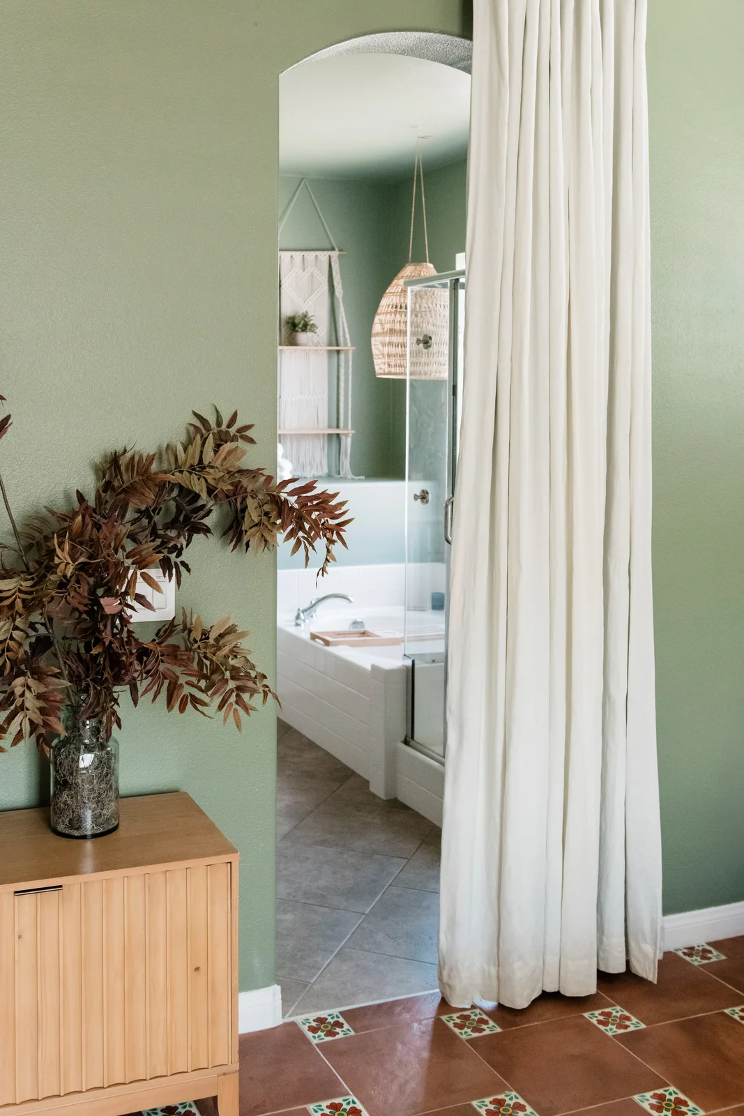
Terracotta field tile with Talavera accent dots at every intersection. The pattern is subtle in photos and present in the room.
The problem with tile is that samples lie. A 4x4 chip looks completely different from a laid floor, and even a small sample board looks different than the actual tile under the actual light in the actual room. We brought samples in from La Tile and Stone, put them down in the space, looked at them in morning light, afternoon light, and the orange-pink light that comes through Indio windows around 5pm. The first two read too grey, the third came out orange instead of terracotta, and the fourth got close but had too much variation in color; the fifth finally landed.
The Talavera dots were Dawn's call. A terracotta-only floor would have been warm and correct. The accent dots add something specific, a hand-made quality that brings the Cuba reference off the mood board and into the material. The 4x4 pieces are sourced one by one and no two are identical, which is either charming or a quality control nightmare depending on your tolerance for imperfection. We found it charming.
The green color question
The walls are Fair Spring from Dunn Edwards, a sage that reads differently at every hour of the day. In morning light it's almost grey. By afternoon it's clearly green, soft and muted. At dusk, with the sconce on, it goes warm and close, the walls feel nearer without feeling smaller.
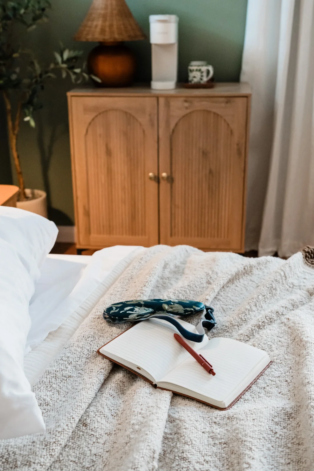
The credenza coffee station against the sage green wall. Wicker lamp, arched doors, Keurig and mugs, all of it within arm's reach of the bed.
Getting to that specific green took work. The test swatches made it clear quickly which direction was wrong: anything with blue undertones turned the room into a spa, something serene but anonymous. Anything with too much yellow read as kitchen paint. We needed a green that felt like it belonged in the desert without impersonating the desert, something that could hold its own against terracotta tile and not look like they were fighting each other.
Fair Spring threads that needle. It has enough grey to stay grounded and enough green to be distinct. The name is slightly misleading. There's nothing fresh-spring about it in person. It's quieter than that, more dusk than morning, which is exactly what a bedroom should be.
What the final room is
The primary is the quietest of the three bedrooms at Terra Luz. The Wild Tropics room is loud in the best way, floor-to-ceiling mural, bold blue accents, the one guests photograph first. The Cali Room has its own energy with the Kahlo Blue workstation hiding behind bifold doors. The primary asks less of you. It's the room where the volume gets turned down, not because it gave up on having a point of view, but because the point of view is rest.
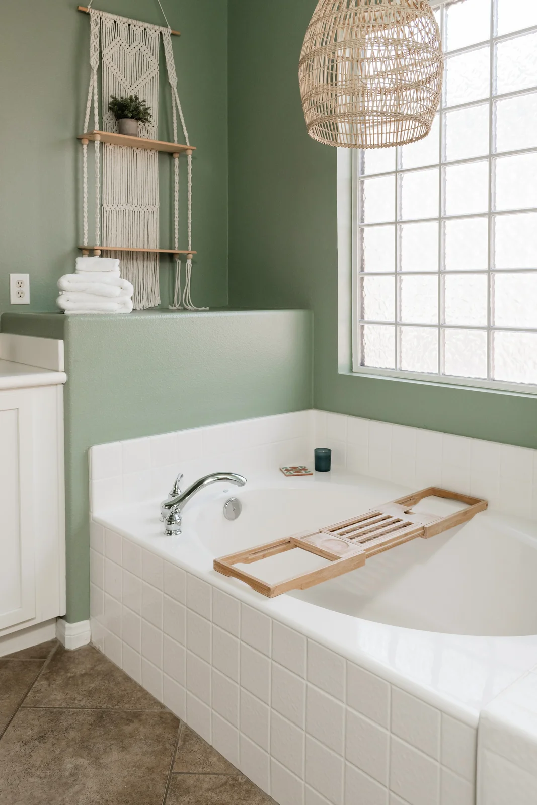
The ensuite. Soaking tub with a wooden bath tray, macrame shelf, rattan pendant overhead. Same Fair Spring walls as the bedroom.
The ensuite carries the same sage green through, so stepping from bedroom to bathroom doesn't break the mood. Soaking tub in the corner, walk-in shower beside it, double vanity with gold hardware. The rattan pendant over the tub was Dawn's addition, a small gesture that keeps the material language consistent between the rooms without requiring that every surface be thematic.

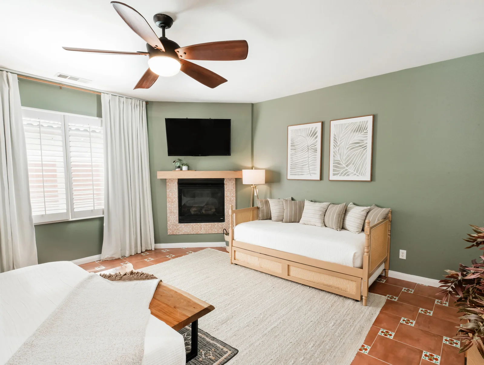
The rattan daybed against the far wall. Secondary sleeping option, reading spot, or just a place to put your bag that isn't the floor.
The rattan daybed along the back wall is the detail I'm most glad we added. It reframes the room from a place to sleep into a place to be. You can read there while your partner sleeps, or kids can use it as a second bed: either way, it makes the square footage feel earned rather than just present.
The trundle pulls out from under the king frame. Extra sleeping option without a cot taking up the room permanently.
For the full property, including the pool, outdoor kitchen, and what the renovation cost, read what I built at Terra Luz. And if you're booking for Coachella or Stagecoach, the outdoor living post covers the patio and pool situation in more detail. Book direct at indigopalm.co/terra-luz.